Finding a new home like booking on Airbnb: the website of a US home builder
Rubén redesigned a home builder's website so that finding a home feels like booking on Airbnb: clear filters, key information in view, favourites, and the neighbourhood as the starting point.
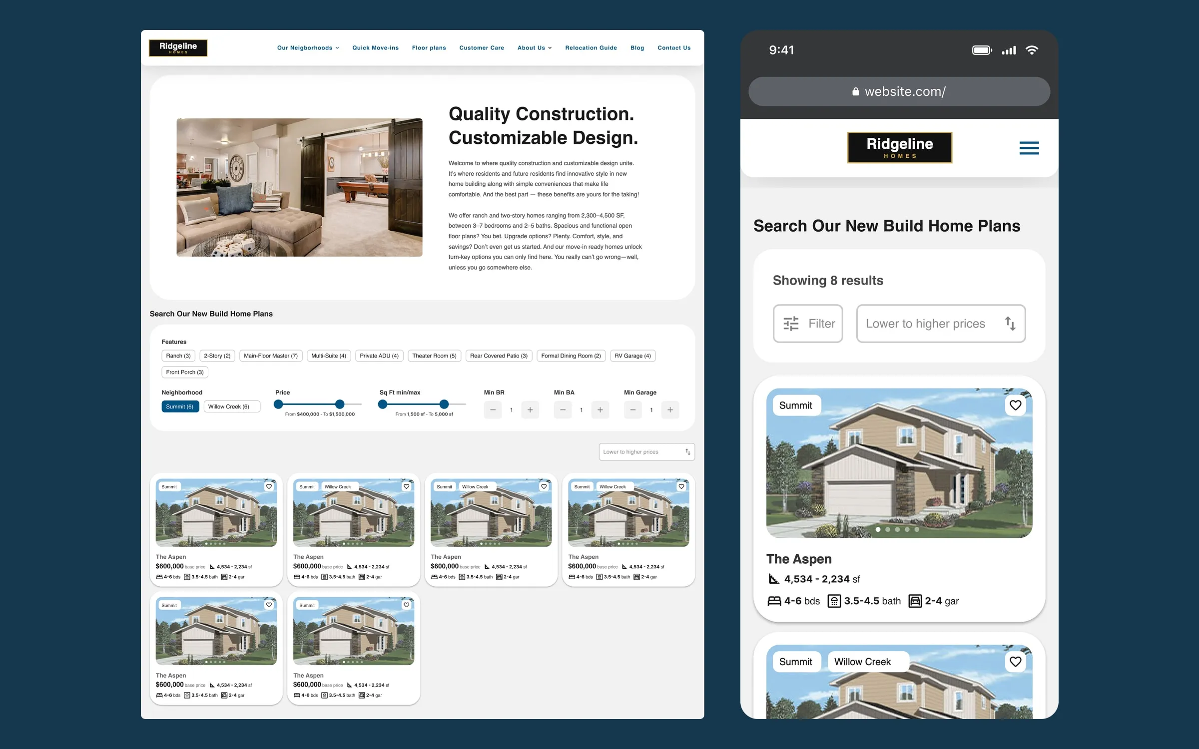
Context
A US semi-custom home builder, building in large master-planned communities with pools, parks and shared amenities, wanted to rebuild its website. It sells in two ways: home plans that buyers customise before construction, and homes that are finished or nearly finished, ready to move into.
Rubén worked on it with the Twelve Legs Marketing team, owning the UX/UI design of the whole site and part of the research; his colleagues handled project management and development. The project is confidential, so the brand, neighbourhood and plan names shown in the images are fictional.
Challenge
The information architecture was chaotic. Promotions were hidden several clicks deep, there were no base prices, lot maps sat at the bottom of each neighbourhood page, and testimonials lived on a page nobody visited.
Behind it was a complex reality: each neighbourhood has its own rules, and not every plan can be built in every one. The two ways of selling also work differently. A move-in ready home has an exact address, price and features; a plan has a different base price in each neighbourhood, plus ranges for square footage and bedrooms.
Process
In the sessions with the client, the team kept coming back to the same reference: Airbnb. There you choose where you want to be first, filter by what matters to you, and see each option's photos and key details without opening it. The same holds here: people buying a new home choose the neighbourhood before the house.
From there, Rubén defined three entry paths: start from a neighbourhood and see which plans fit it, start from a plan and see where it is available, or go straight to move-in ready homes. The goal across all of them was fewer clicks, with the important information always in view.
He also researched pagination versus a "load more" button for the listings, weighing both user experience and SEO, so the decision could be made together with the development team.
Solution
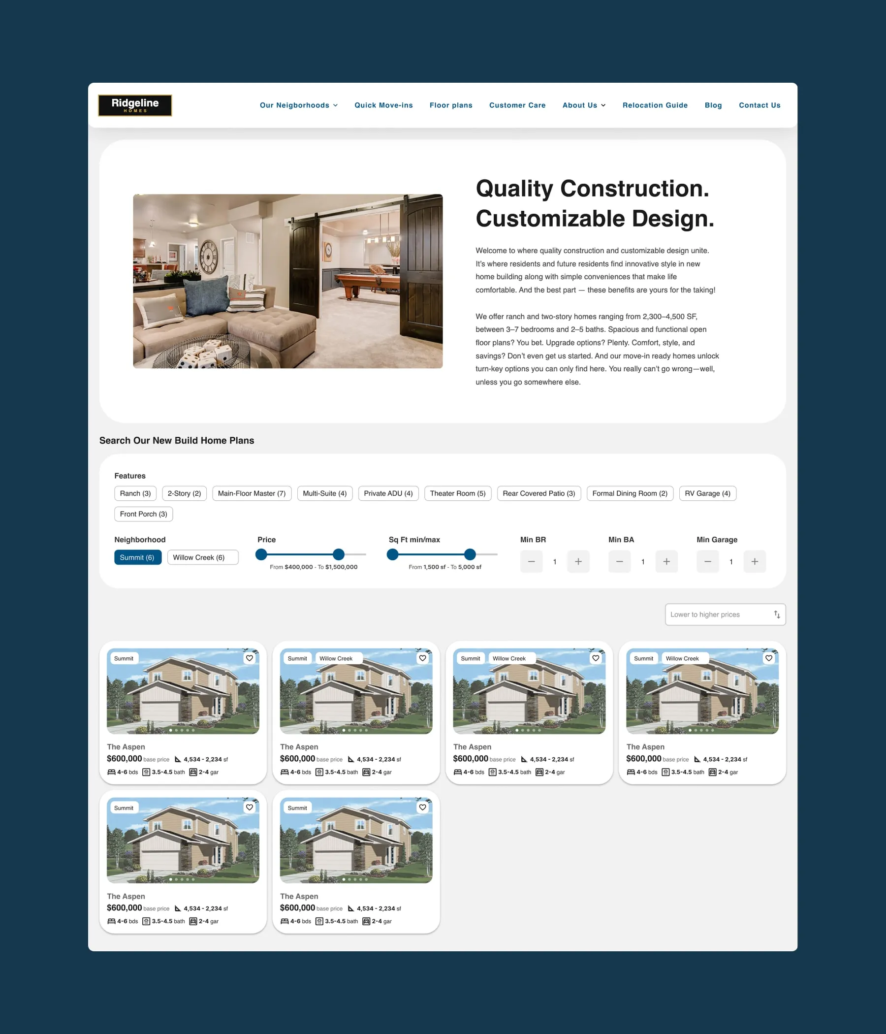
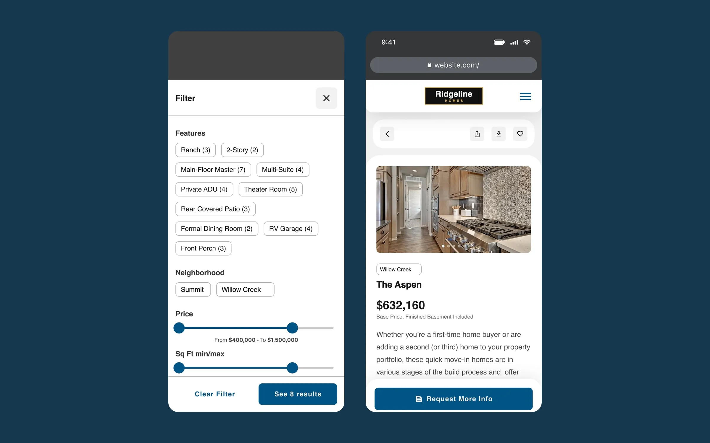
- Airbnb-style filters. Features (ranch, main-floor primary suite, covered patio…), neighbourhood, price, square footage and minimum bedrooms, bathrooms and garage spaces, with the number of results for each option.
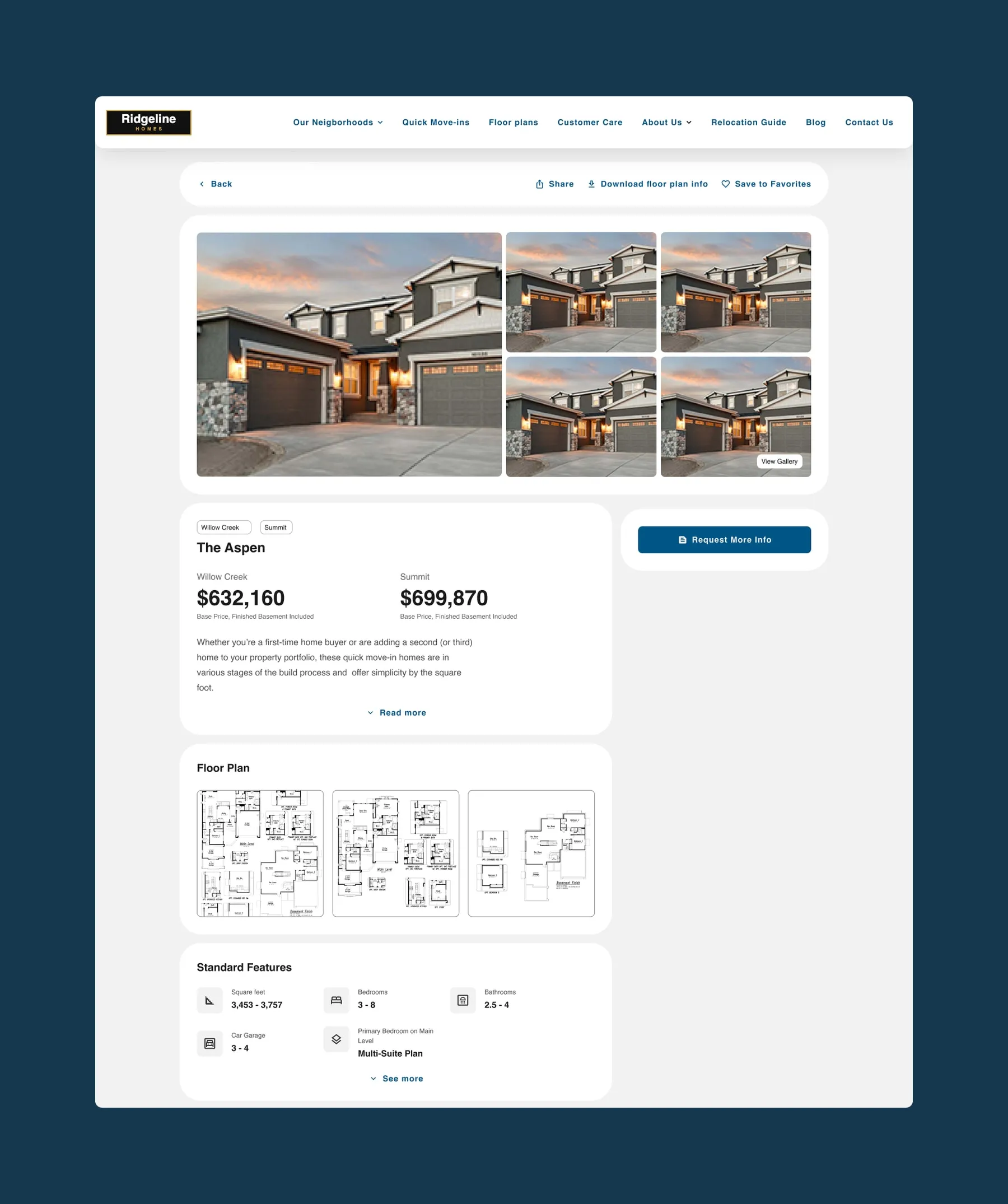
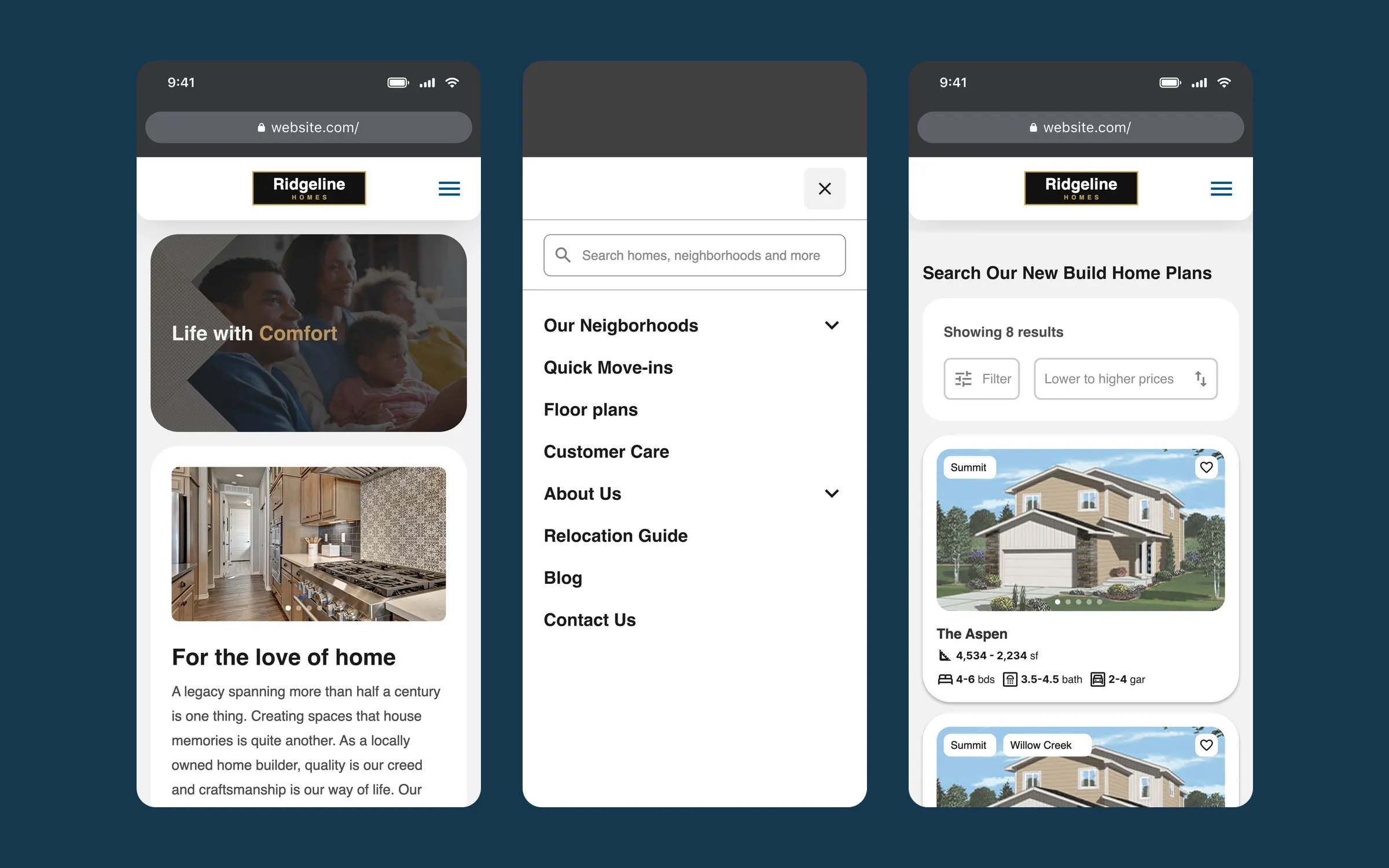
- Cards you can explore without opening them. Each card has its own photo carousel, the neighbourhood where it is available, the price and the basics. Move-in ready cards show exact values and a single neighbourhood; plan cards show ranges.
- Pages with the essentials up top. Gallery, base price per neighbourhood, floor plans, standard features and the virtual tour, with share, download and save always in view.
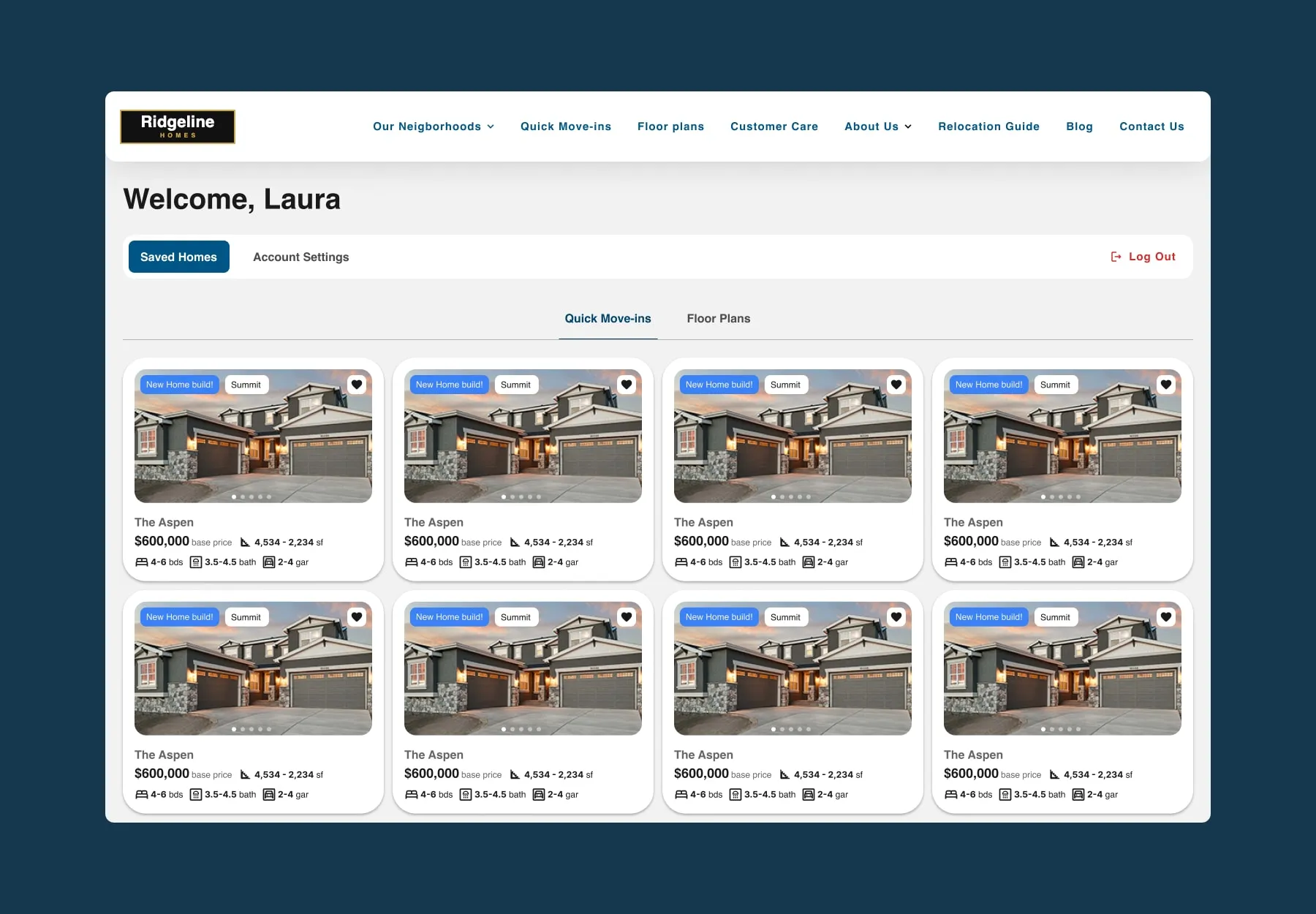
- Favourites with an account. The heart on each card saves a plan or a home, and keeping them requires signing up. In the account, favourites are split into move-in ready homes and plans.
- Forms with context. Forms capture the plan, the neighbourhood and the filters each person used, so the sales team knows what they are looking for before calling them.
Mobile version
The site is also designed for mobile. The menu opens full screen with search at the top, search filters open in their own panel with the result count on the button, and on the plan page the request for information stays fixed within thumb reach.
Outcome
The site is live, with sign-up favourites and the interactive lot map in place. Buyers can see base prices, filter by what they need and save their options without having to call anyone.
Success stories
See all cases
Dr. Alfonso Prada, Madrid
Dr. Alfonso Prada secures his first online bookings with a website designed to convert
Read the case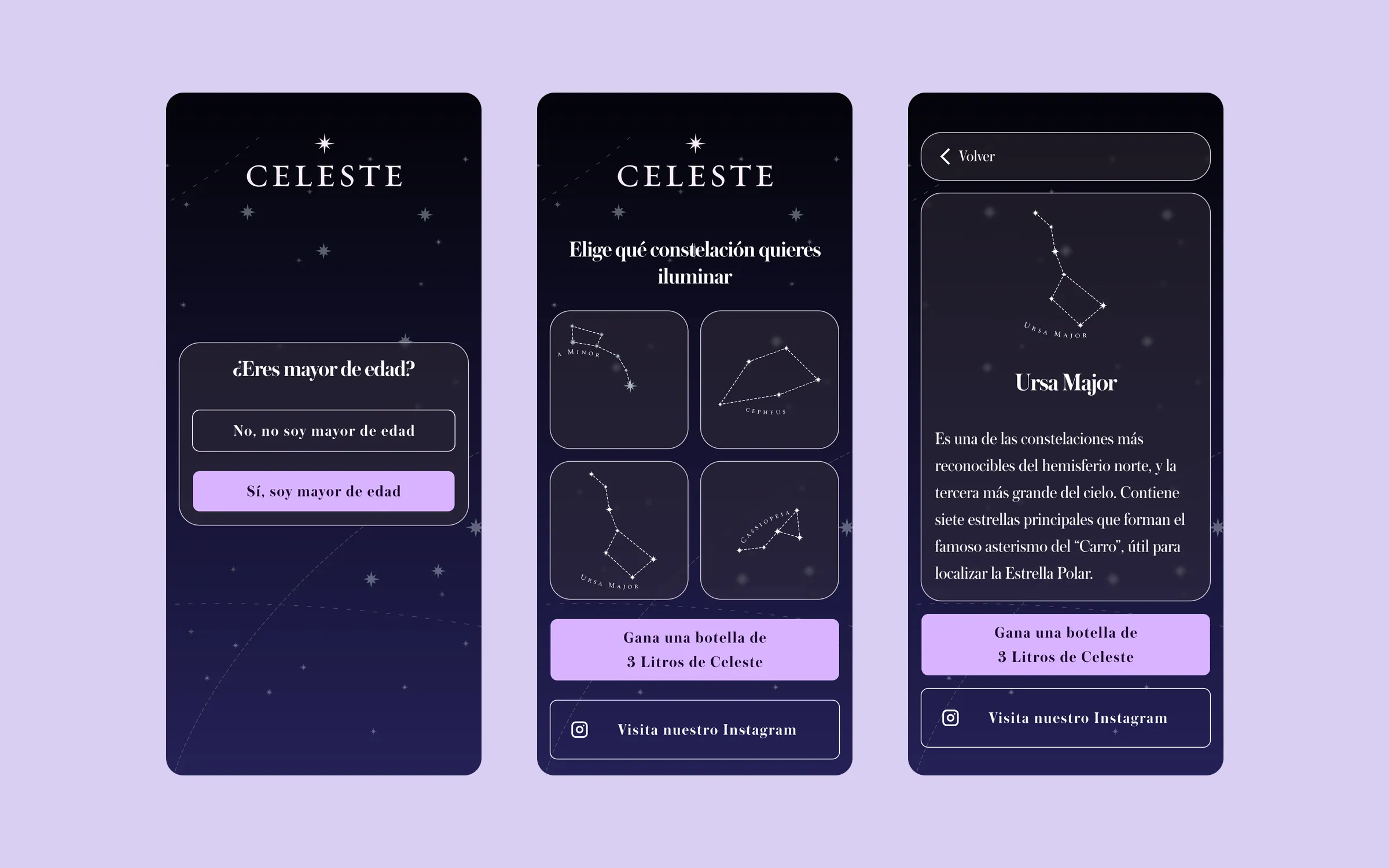
Familia Torres
A shop window you light up from your phone: the Celeste web app for Familia Torres
Read the case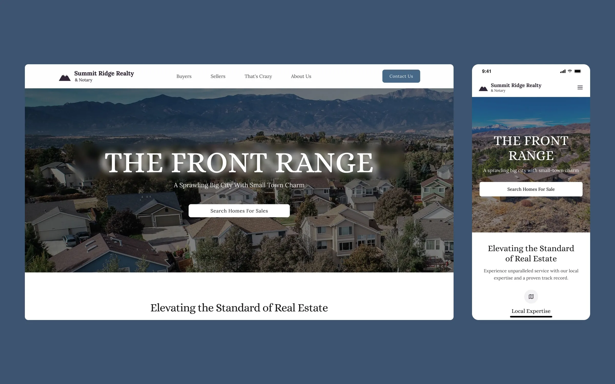
Local real estate and notary agency (Colorado, US)
A Colorado real estate agency's website, with one journey for buyers and one for sellers
Read the case
Are your buyers getting lost before they find what they need?
- Reply within 24 h
- No obligation
- Written quote
Your quote, within 24 hours
Answer 4 quick questions and we'll send you what we'd do, how long it would take and what it would cost.
What happens next
- We review your project ourselves, not a bot.
- We send you a fixed quote within 24 business hours.
- If you like, we go through it on a 30-minute call.
We've received your request and emailed you a copy.
 Rubén R. will reply
 Petya K. will reply
What you told us
What happens next
In a hurry? Jump ahead: