Most B2B service websites don't generate sales. Not because the service is bad, but because the website is written for the business owner, not for the customer. It describes what you do, lists features, and repeats the word “professional” four times… and never answers the one question the reader has: “Does this solve my problem, and can I trust you?”
A good service page does two things at once: it speaks to Google (and AI) so they can find you, and it speaks to a person with a specific problem so they’ll choose you. These two things don’t compete; they reinforce each other. In this guide, I’ll show you how to write and structure them so they do both, with B2B examples you can use today.
Read them together and you’ll see the challenge: B2B buyers do their research almost entirely on their own, make decisions in seconds, and leave if the website is slow. Your page needs to load quickly, grab their attention at first glance, and close the deal without anyone from the sales team being there. If speed is your bottleneck, start here: how to improve your website’s speed and increase conversions.
A high-converting service page is a page dedicated to a single service, optimized for a specific search intent, that guides the reader from their problem to a clear call to action (book, contact, request a quote). It’s not a catalog or an “About Us” page—it’s a sales tool focused on a single goal.
The key is in “one service, one page, one intent”. If you sell SEO audits, UX consulting, and web design, that’s three separate pages—not a list within a single section. Each one ranks for its own keywords and attracts a different type of customer.
In B2B, the buying cycle is long, and the decision is made by several people. Your services page is what the purchasing committee reads on their own, at 11 p.m., while comparing you to two competitors. It’s also what AI engines cite when someone asks ChatGPT, “Who does X in Barcelona?” If that page is clear, well-structured, and demonstrates authority, it works in your favor on both fronts.
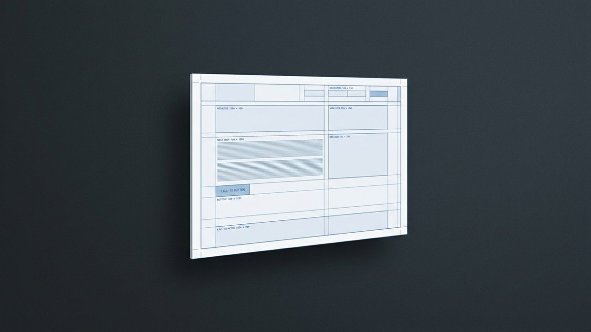
This is the structure we use at Deseo Lab, and the one I recommend to B2B clients. Seven sections, in this order. It’s not a rigid template, but the order matters: it aligns with how the buyer’s mind makes decisions.
The layout of these seven blocks isn't just for decoration—it's what drives conversions. Visual hierarchy, white space, buttons that stand out, and forms that don't intimidate users. That's where conversion-oriented UX/UI design makes the difference between a page that’s read and one that sells.
The best phrases on your website aren’t written by you—they’re said by your customers. Capture how they describe their problem in calls, emails, and reviews, and use their exact words. If your customers say, “My website isn’t converting,” write that—not “funnel conversion rate optimization.”
Each service offering should answer the question, “What’s in it for me?” The feature explains the “what”; the benefit explains the “why” it matters. Combine the two: “Migration with 301 redirects (feature) so you don’t lose a single ranking position on Google when you redesign your site (benefit).”
“Measurable results” means nothing. “+20–50% organic traffic in 6 months” does. Numbers, timelines, and specific examples build trust precisely because they are verifiable.
Petya's Advice Read your page aloud as if you were explaining it to a client over coffee. If it sounds like a corporate brochure, rewrite it. Deseo Lab’s voice—approachable, direct, and expert without being intimidating—converts better than any agency jargon. People buy from people.
A perfect webpage is useless if no one can find it. Here are the on-page fundamentals you can't skip:
If you want to know exactly how technical SEO, content, and user experience fit together in a B2B business, we cover it in detail in the comprehensive SEO + UX guide for B2B businesses. And before you optimize anything, it’s important to know where you’re starting from: an SEO audit in 2026 will show you what’s holding your pages back today.
More and more B2B buyers are starting their research by asking ChatGPT, Gemini, or Perplexity instead of Google. The Answer Engine Optimization (AEO) aims to get your brand mentioned in those responses, capturing demand even if there’s no click. Well-structured service pages are your best tool for achieving this.
Example 1 · B2B SaaS
Example 2 · Professional Consulting
Example 3 · Marketing Services / Agency
"A service page isn't measured by how pretty it is, but by how many meetings it generates. Everything else is just window dressing."
One. Each service deserves its own dedicated page, optimized for its search intent and target audience. Grouping them together hurts the search rankings and conversion rates for all of them.
Just enough to answer all the customer’s questions and demonstrate expertise, without any fluff. In B2B, it typically ranges from 800 to 1,500 words, but clarity is key—not word count.
Organize your content with clear headings, define terms at the beginning of each section, include an FAQ with real questions, and demonstrate expertise using case studies and verifiable data. This makes it easier for ChatGPT, Gemini, or Perplexity to cite you.
A single, repeated goal. Place the same main CTA at the top, in the middle, and at the bottom of the page. Multiple different actions compete with each other and reduce conversion rates.
Technical and UX improvements are typically seen within 4–8 weeks; sustained organic growth takes 3–6 months to take hold, depending on the competition and industry. Visibility on AI search engines can happen more quickly.